Strategy
Brand Consistency in B2B: Rules and Guidelines That Hold at Scale
Brand consistency means the same identity, voice and message everywhere. How a three-tier rule set, findable guidelines and a spot-check keep it intact as you grow.
Key takeaways
- Brand consistency means the same identity, voice and message at every touchpoint, and it's about rules applied to assets, not about whether teams agree on the story.
- Consistency breaks at scale because more people make brand material than a brand team can review, and a 2016 study found only one-fourth of organizations enforced their guidelines formally.
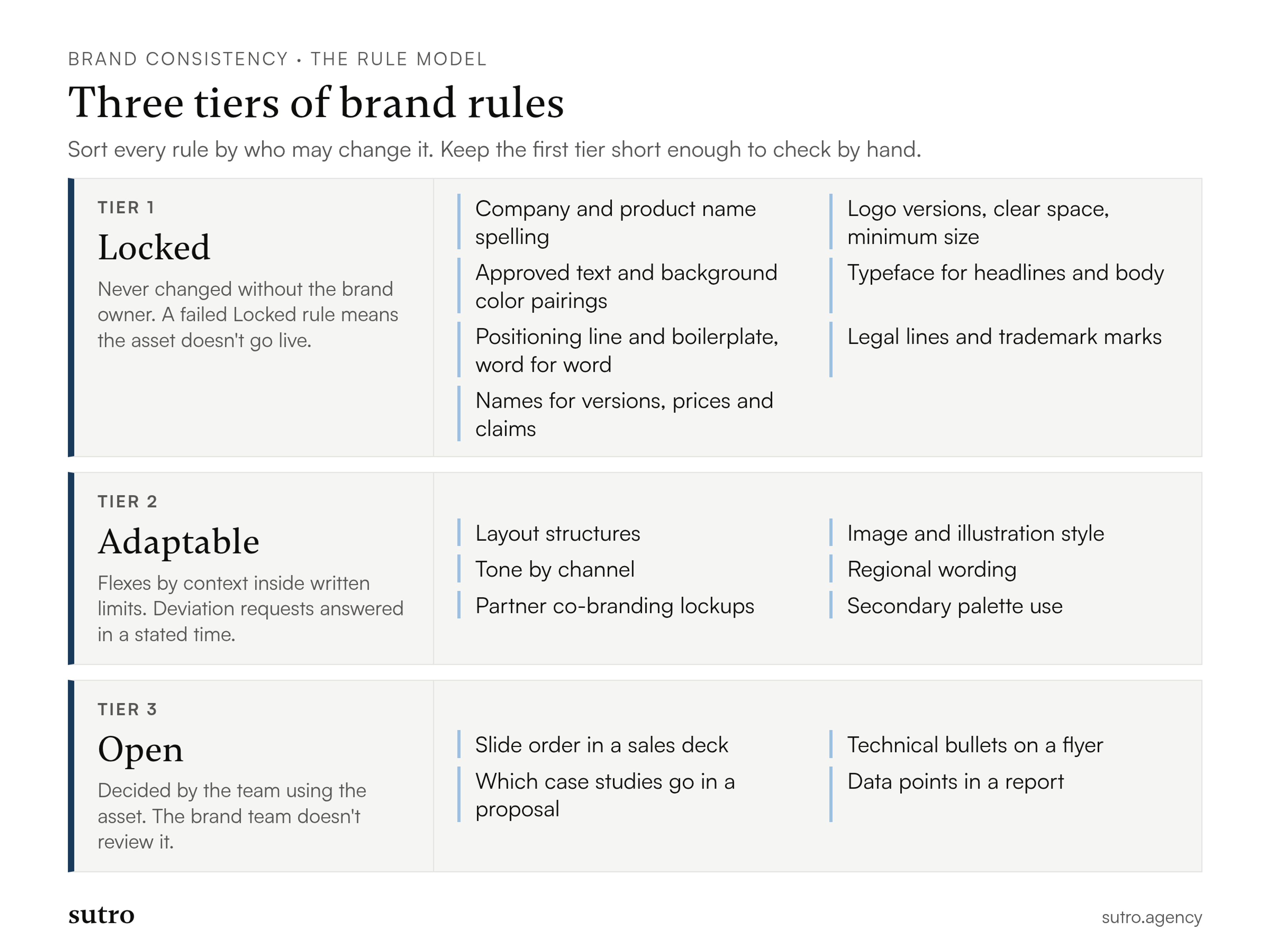
- Sort rules into three tiers: Locked (never changed without the brand owner), Adaptable (flex within stated limits) and Open (decided by the team using the asset).
- Write each rule as a one-line card with a reason and an example, keep it findable in one click and give people a deviation path with a stated answer time.
- Check consistency with a quarterly spot-check: sample live assets from five channels, score them pass or fail against the Locked rules and fix the weakest channel.
Brand consistency is presenting the same identity, voice and message at every touchpoint, and in a growing B2B tech company it holds only when a short set of rules is actually enforced. It's about rules applied to assets. Whether your teams agree on the story in the first place is a separate question, covered in getting marketing, sales and product to agree on one story.
Most guideline documents fail for one reason: they treat every rule as equally important, so nobody can tell which ones matter. How we set brand rules for growing B2B tech teams starts from the opposite end. We decide which few rules are never broken, which ones flex with context, and which decisions belong to the team using the asset. This article walks through that model, how to write rules people follow, and how to check consistency without reading every file your company publishes.
Why consistency breaks as a B2B company grows
Consistency breaks at scale because more people produce brand material than a brand team can review, and each of them is working to a deadline. A growing company can have a central team of a few people and hundreds of employees who touch the brand: sales engineers rewrite decks, product managers ship interface copy, developer relations teams publish docs, field marketers build event material and regional teams spin up their own pages.
The numbers from the best-known study on this are old and self-reported, so read them as direction, not as a current benchmark. In 2016, Demand Metric and Lucidpress surveyed mostly B2B and mixed organizations. Their press release on the research reports that fewer than 10 percent said their brand presentation was very consistent, while almost 90 percent agreed it matters. Almost all claimed to have guidelines, yet only one-fourth had formal guidelines that were consistently enforced. Over 60 percent said materials that don't conform to the guidelines are always, often or sometimes created, and 71 percent named confusion in the market as the biggest harm.
The gap between "we have guidelines" and "we enforce them" is the problem this article is about. Enforcement is not about being strict. It's about making the rules short enough to check and easy enough to find.
What actually needs to be consistent
Six things need consistency rules in a B2B tech company: visual identity, voice, core messaging, templates, product and docs surfaces, and channels. You don't need identical execution on all six. You need to know which parts of each one are fixed.
- Visual identity: logo use and clear space, the color palette, typography and image style. These are the fastest cues a buyer uses to recognize you.
- Voice: terminology, tone and grammar. Keeping it steady across channels is a job of its own, covered in keeping one voice across channels and AI tools.
- Core messaging: the positioning line, value propositions and the boilerplate paragraph about the company.
- Templates: decks, one-pagers, whitepapers, social graphics and email layouts.
- Product and docs surfaces: interface components, product names in the UI, documentation sites and developer portals.
- Channels: email, social profiles, partner pages, event booths and marketplace listings.
A developer portal and a LinkedIn ad can't look the same. The rules below decide what must stay identical between them.
The Locked, Adaptable and Open rule model
The model sorts every rule into one of three tiers by who may change it: Locked rules can't change without the brand owner, Adaptable rules flex within stated limits, and Open decisions belong to the team using the asset. It answers a failure I see often: a 40-page brand book where logo clear space and the choice of a stock photo carry the same weight, so people ignore both.
Keep the rule count asymmetric on purpose. Locked is short. Adaptable is longer but has clear limits. Open is everything else and needs no rules at all.
Locked
Locked rules are the few you never bend. If an asset breaks one, it doesn't go live. I keep this list short enough that a non-designer can check their own work in a couple of minutes, usually under ten rules. The count is my working recommendation, not a research finding. The right number is whatever your team can verify by hand.
A typical Locked list for a B2B tech company:
- the exact spelling and capitalization of the company name and every product name;
- logo versions, clear space and minimum size;
- the core palette and the approved text and background color pairings;
- the typeface for headlines and body text;
- the one-line positioning statement and the boilerplate paragraph, word for word;
- legal lines, trademark marks and required disclaimers;
- the naming rule for anything that carries a version, price or claim that sales can be held to.
On color, be precise about what is locked. The Web Content Accessibility Guidelines 2.2 (success criterion 1.4.3) require a contrast ratio of at least 4.5:1 for text, and 3:1 for large-scale text. Text that is part of a logo or brand name has no contrast requirement, so a pale logo is a design choice, not a compliance question. A pale gray body text on a white slide is both a consistency failure and an accessibility failure. Lock the approved text and background pairings, not just the hex codes, so that nobody has to measure contrast by eye.
Adaptable
Adaptable rules flex by context, inside limits you write down. They cover layout structures, image choices, tone by channel, regional wording and partner co-branding. The person making the asset can use judgment, as long as they stay inside the boundary.
Partner co-branding is the clearest B2B case. If your product integrates with a major cloud platform, field marketers will need a lockup with two logos. Put the limits in the rule itself: which logo leads, the minimum space between them, and which partner approvals apply. Then they can build the asset without waiting for a designer, and the Locked tier stays intact.
Regional wording works the same way. A page for Germany may need different phrasing around compliance. The rule says which terms must stay as they are (product names, the positioning line) and which can be localized.
Open
Open decisions belong to the team using the asset. An account executive who reorders the middle slides of a deck to answer a security question from a CIO is making an Open choice. A developer advocate picking which technical bullets go on a meetup flyer is making one too. The brand team doesn't review these.
Giving up the Open tier is how you buy compliance on the Locked tier. When people see that the rules leave them room to do their job, they stop treating the brand team as a checkpoint to avoid. A brand owner who tries to approve everything ends up approving nothing in time, and that is when people publish off-brand work on their own.
How to write rules people actually follow
Rules get followed when each one is a single line with a reason and an example, and when anyone can find it in one click. Guidelines often lose to a simple search problem: the PDF lives on a shared drive nobody remembers, so people copy the last deck they found.
Write every rule in the same three-part card:
Rule: Write the company name as "Northgate Cloud", never "NorthGate" or "NGC".
Why: Buyers search for the name, and legal terms and contracts use the registered form.
Example: Correct: "Northgate Cloud Monitor." Incorrect: "NGC monitor." (Illustrative; fictional company.)
Four habits make the cards work:
- Put them where work happens. A searchable page linked from the company wiki, the chat sidebar and the template library beats a PDF. People look in the place they're already working.
- Show the version, the date and the owner at the top of every page of rules, with a name and a way to reach them.
- Write for non-designers. A sales engineer needs "use this deck, change only the title and the customer logo", not an essay on the logic of the palette.
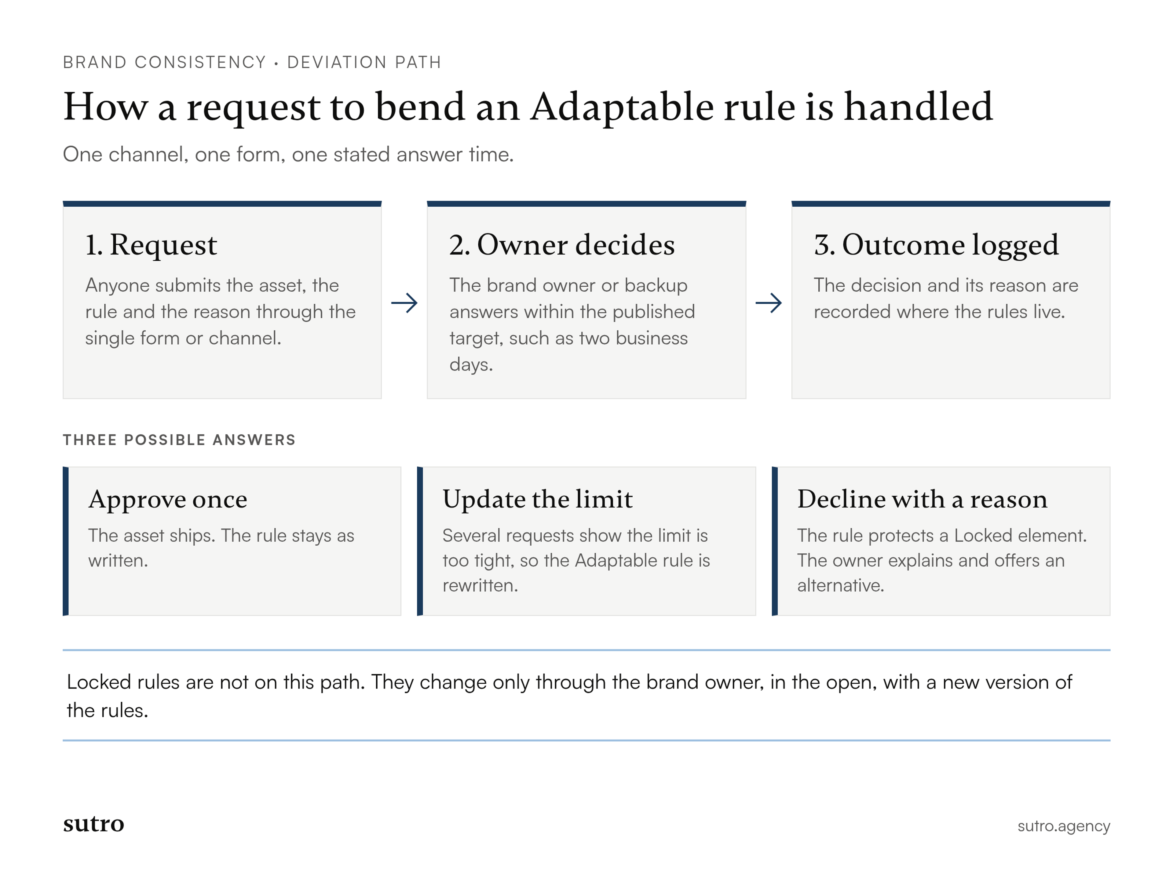
- Publish a deviation path. Anyone can ask to break an Adaptable rule through one form or channel, and gets an answer in a stated time. I suggest two business days as a working target. It's not a benchmark. The point is that a request never takes longer than the deadline it's meant to serve.
The same page can say where the line is with neighboring work. The templates, asset library and ownership model that make rules usable at volume are described in the full build of templates, asset library and governance, so keep your rule cards short and let the system article carry that part.
How to check consistency without slowing anyone down
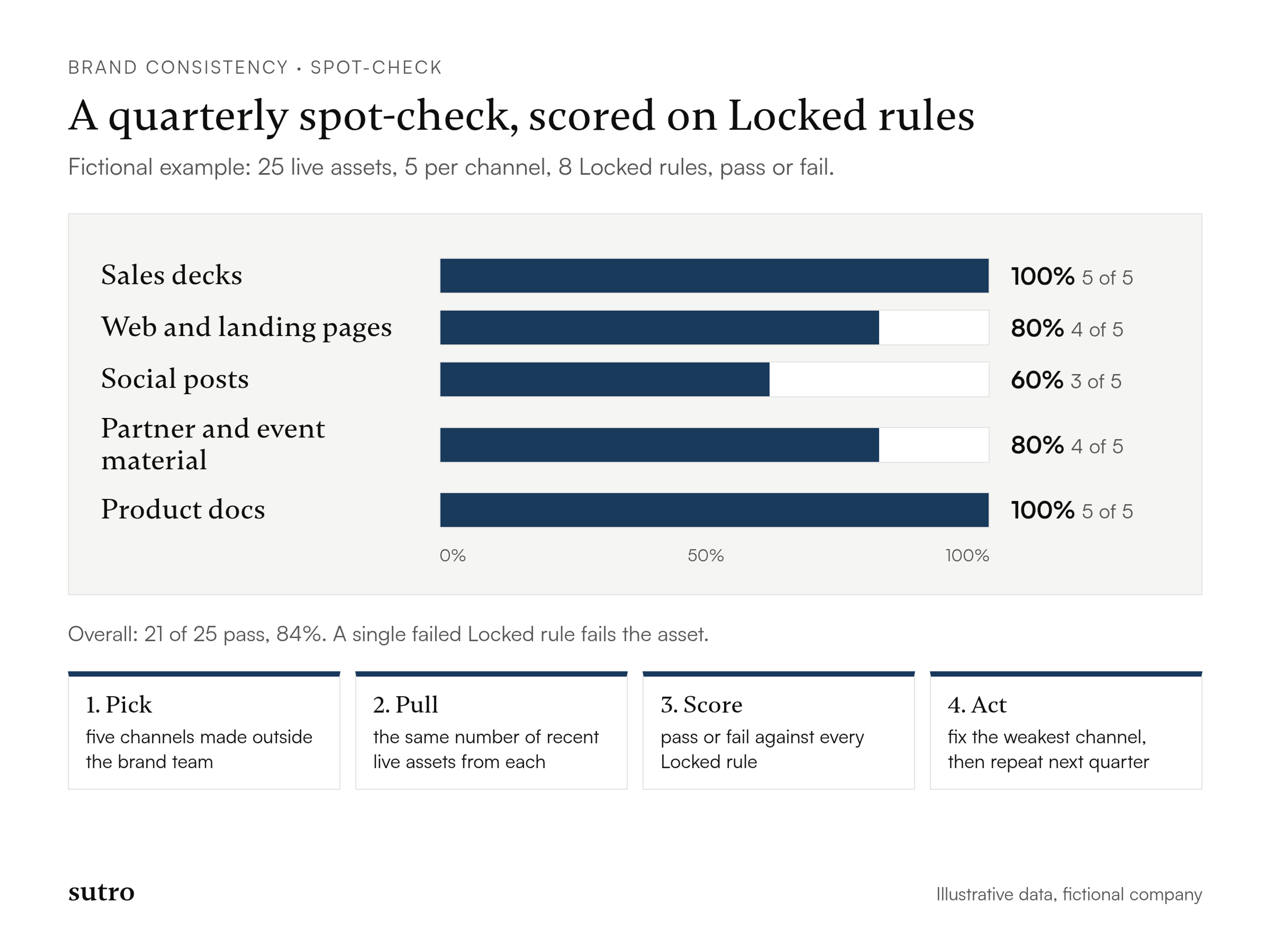
You check consistency with a recurring spot-check: pull a fixed sample of live assets from your main channels, score each one only against the Locked rules, and look at the pass rate per channel. Reviewing every asset before it goes out would make you the bottleneck. Sampling after the fact tells you where the drift is, and takes far less time than pre-approval.
The protocol has five parts:
- Pick five channels where brand material is produced by people outside the brand team: for example sales decks, web and landing pages, social posts, partner and event material, and product docs.
- Pull the same number of live assets from each, five is enough to start. Take the most recent ones, not the best ones.
- Score each asset pass or fail against every Locked rule. One failed rule is a fail. No partial credit, because Locked means locked.
- Calculate the pass rate per channel and overall.
- Act on the weakest channel. Fix the template, rewrite the unclear rule or train the team. Then run the same check next quarter and compare.
A worked example (fictional)
Take a fictional infrastructure software company, Halvorn Systems, with eight Locked rules. Its brand owner pulls five live assets from each of five channels, 25 assets in total, and scores each one against the eight rules.
- Sales decks: 5 of 5 pass, 100 percent.
- Web and landing pages: 4 of 5 pass, 80 percent.
- Social posts: 3 of 5 pass, 60 percent.
- Partner and event material: 4 of 5 pass, 80 percent.
- Product docs: 5 of 5 pass, 100 percent.
That is 21 passes out of 25, or 84 percent overall. The overall number hides the useful part. Both failed social posts used light gray text on a pale background that isn't an approved pairing, and the social template turns out to predate the palette change. The fix isn't a lecture. It's a corrected template and a one-line card about text color pairings. The failed landing page and the failed partner asset both misspelled a product name, so the owner also checks whether the name card is easy to find.
Treat any threshold you set, say a channel below 80 percent gets attention, as your own working rule, not an industry standard. I don't know of a published benchmark for per-channel pass rates, and the example numbers are made up to show the arithmetic.
What causes drift, and how to fix each cause
Drift usually has an operational cause, not a design one, so the fixes are operational too. A redesign won't help if nobody can find the current logo file.
- Unfindable or outdated guidelines. When the rules live in a buried file, people guess. Put them on one searchable page and link it from every template.
- No owner. If nobody is accountable, enforcement fades. Name one person with the authority to say no, and a backup.
- Slow review. If review takes two weeks, field teams publish without it. Use the deviation path and the stated answer time.
- Tool sprawl. Five design tools produce five versions of the brand. Keep approved templates in one or two tools and retire the rest.
- Acquired brands. An acquisition brings a second visual system overnight. Give the acquired team a temporary Adaptable tier with a written end date while you plan the migration. Locking everything on day one only causes quiet resistance.
- AI-generated content. Language models don't know your terms. They invent phrasing, soften claims and use consumer-style adjectives. Give any AI tool the Locked wording as input, list the terms it must never use and have a person review anything public.
Product and developer surfaces need their own rules
Product, docs and developer material need the Locked tier applied to names, logo and color, with the written tone and structure left Open or Adaptable. Technical readers want accuracy and clarity, and a documentation page rewritten to sound like a campaign page serves them worse.
For API references, readmes and developer portals, lock the product names, the logo and the accessible color pairings. Let engineers and technical writers decide structure and phrasing, inside whatever style conventions the docs team already uses. The aim is that a developer who goes from your marketing site to your docs to the product's login screen sees the same company, not the same page layout.
Common mistakes
- Treating consistency as a launch deliverable. A new identity and a template library are the start of the work. Templates break, new asset types appear and people join. If nobody checks output, drift returns.
- Writing forty equal rules. If everything is mandatory, nothing is. Cut the Locked list until it fits on one screen.
- Assuming templates solve it. Templates fix layout. They don't fix names, claims or wording typed into them.
- Skipping the check. Without sampling you hear about drift from a buyer, which is the most expensive way to find out.
Conclusion
Brand consistency holds at scale when the rules are few, written as cards people can find, and checked on a schedule. Lock the handful that must never change, let the rest flex inside stated limits, and leave the remainder to the teams doing the work. Then sample live assets each quarter, fix the weakest channel and run it again.
If your teams are producing material faster than anyone can review it, tell us which channel drifts most and we'll talk through where to start.
Questions
- What is brand consistency?
- Brand consistency is presenting the same visual identity, voice and core message everywhere a buyer meets a company, from the website and sales deck to the product and the docs. In B2B tech it works through a short set of rules that people apply to assets, which makes the brand easy to recognize and easy to trust.
- Can you give me an example of brand consistency?
- Take a hypothetical B2B payments company called Orven. Its name, logo lockup, product terms and tagline stay the same across the website, the sales deck, the product UI and the invoice: Orven, the current logo lockup, the product name Orven Settle, and "Payments that settle when you say they will." The inconsistent version still uses last year's logo on the invoice, calls the product "Orven Payments" in the deck while the app says "Orven Settle," and rewords the tagline to "Fast payments you can trust." A buyer who sees all four has to guess whether they are dealing with one company.
- What is the difference between brand consistency and brand alignment?
- Consistency is about assets: the same name, logo, colors, voice and claims wherever they appear. Alignment is about people: marketing, sales, product and support agreeing on the story they tell. A perfectly consistent deck can still tell the wrong story, so alignment comes first and consistency keeps it uniform.
- How many brand rules should a company have?
- Keep the Locked list short enough that a non-designer can check their own work, usually under ten rules in my experience. That's a working recommendation, not a research finding. Put flexible rules in the Adaptable tier with written limits, and leave tactical choices Open.
- Why do most brand guidelines fail?
- They treat every rule as equally important, they're hard to find and nobody owns them. A 2016 Demand Metric and Lucidpress study found almost all organizations said they had guidelines, but only one-fourth had formal guidelines that were consistently enforced. Short rules, one findable home and a named owner fix most of it.
- How do you check brand consistency without reviewing everything?
- Run a spot-check each quarter. Pull the same number of recent live assets from five channels, score each one pass or fail against the Locked rules and calculate the pass rate per channel. Fix the weakest channel first, then repeat the check the next quarter.
- How does AI-generated content affect brand consistency?
- AI tools invent terms, change tone and soften claims unless you constrain them. Give them the Locked wording and your banned terms as input, and have a person review anything that goes public. Treat AI output as one more channel in the spot-check.